
In a recent article in Phi Delta Kappan, Moeller discusses the use of visual thinking strategies to “strengthen students’ communication and critical thinking skills and creativity” (2013). Visual literacy, data visualization, and design thinking are buzzwords in the education rhetoric and are becoming more popular in the classroom partly because of the accessibility of visual creation tools. No longer is robust illustration limited to graphic designers, analytics experts, and lucrative enterprises. Many tools for visual creation are freely available, making them a useful and cost effective instructional tool.
One popular visual that is popping up all over the Web are information graphics, or infographics. Infographics are visual representations of data and are intended to make complex information more understandable by enabling to viewer to graphically view trends, patterns, percentages, etc. These handy little illustrations are not only fun to look at, but are tools with which to teach foundational English literacy and mathematical concepts. Infographic design can help teach students how to properly find sources on the Internet and creatively amalgamate them into a graphic that helps others understand intricate information as well as discover new knowledge of their own.
While infographics are not new on the education scene, new tools for creating infographic are. In the last three years, infographic generators such as Piktochart, Easel.ly, Visual.ly, and Infogr.am were created. In addition, social media outlets such as Instagram, Pinterest, and Tumblr streamline image sharing, allowing for wider infographic dissemination. Educators can capitalize on the popularity of infographics and easy to use infographic generators to teach valuable literacy skills that are aligned with the Common Core in a fun and interesting way. Here are a few ideas:
Common Core Infographic Activities
1) Social/Environmental Issue Infographic
Many infographics are used to represent and explain a problem. Assign each student with a social issue, require them to analyze quantitative information (such as census data), and create an infographic that visually represents the problem (and maybe proposed solution). After the infographic is completed have students analyze and critique each other’s creations. One great example is Justin Beegel’s Crude Awakening, which depicts the 2010 Gulf Oil Spill.
Standard Connections: CCSS.ELA-LITERACY.RI.11-12.7
2) Compare/Contrast Infographic
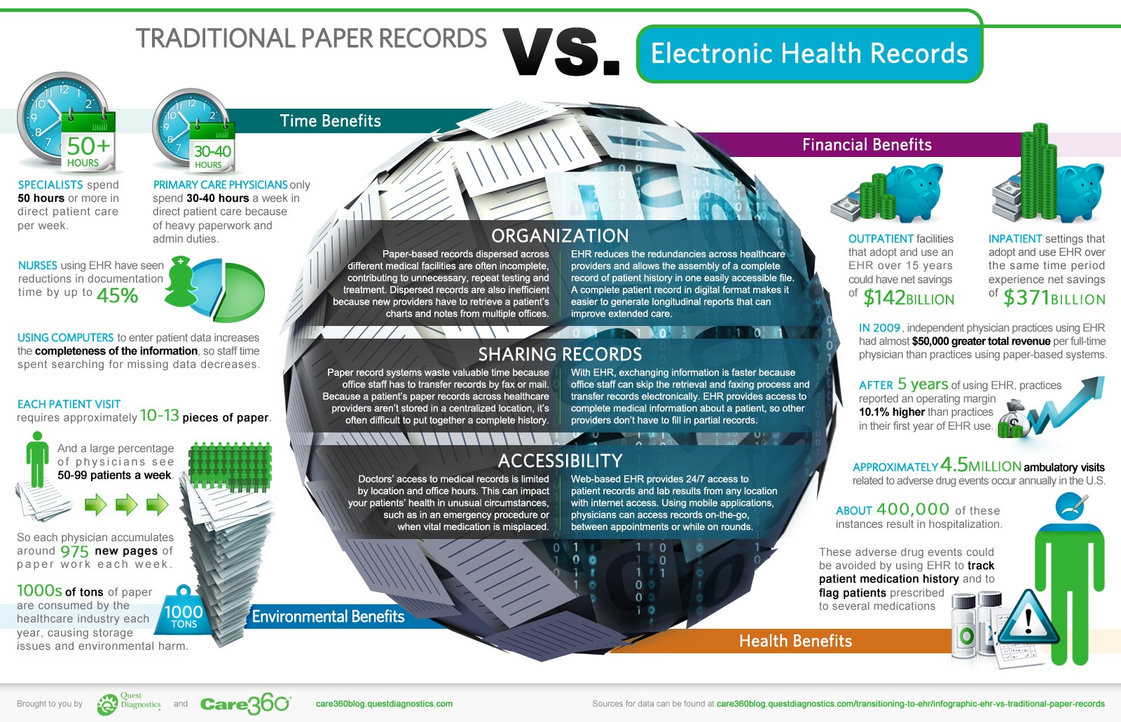
Ask students to analyze a topic, such as Walt Disney, using both a print resource and an infographic and have them answer questions based on each medium: Is the information easier to understand in print or via infographic? What are the pros and cons of using these different formats? Does the information vary greatly? Then have students create an infographic that analyzes the differences between these mediums. Electronic Health Records vs. Traditional Paper Records is a good example of a compare and contrast infographic: http://www.hitconsultant.net/wp-content/uploads/2012/03/quest_infographic_v3.jpg
Standard Connections: CCSS.ELA-LITERACY.RI.9-10.7
3) Interactive Infographic
Ask students to create an interactive infographic and present it to the class. The infographic will require organization and development that combines both visual, technical, and textual writing skills. If used with an infographic generator, interactive components can be added such as video, interactive data visualizations (which includes hovering your mouse over the data for more information), audio, and animation. This will also require knowledge of web publishing and digital image files. Additionally you could incorporate instruction on programming language concepts required to make the infographic interactive (i.e. Flash and HTML5). Flash and HTML5 can help students understand why certain interactive components don’t work on iOS devices and static image files. The infographic, 13 Reasons Why your Brain Craves Infographics, is a useful reference for a project like this as well as a good example of an animated infographic.
Standard Connections: CCSS.ELA-Literacy.SL9-10.5 & 11-12.5
Infographics are also great for collaborative activities. Assign a group of students an infographic project using Piktochart (or another infographic generator). Require each student to work on one portion of the infographic (with Piktochart this is particularly easy because the infographic is divided into “blocks”). Require students to utilize hyperlinks, embed video and images, and implement attractive color schemes.
Standard Connections: CCSS.ELA-LITERACY.W.8.6, 9-10.6, & 11-12.6
4) Statistics & Probability Infographic
One awesome aspect of infographic design is the data visualizations that can be added to them. All the high school statistics standards fall directly in-line with the charts, graphs, plots, etc that can be created for an infographic. Infographic generators, such as Piktochart, have a built in chart feature that allows you to input statistical data. For more advanced features and functions the program allows you to import data from excel files. Once calculations have been made, the data can be interpreted and discussed in the infographic to further comprehension and provide another dimension of learning and understanding.
These are just a few ways infogrpahics can be incorporated into the common core. Do you use infographics in your classes? If so, please share in the comments!

Seems like a great idea. I know I would have liked Stats a lot more if there was a visual component to it – lots of kids learn better this way I feel. Thanks!
Love your new post! I shared it on FB.
Is this what you will focusing on in Grad School?
Remember, this Sunday we have a date for Salvation … :DDDDDDDDDDDDDD
Thanks!! I’m not exactly sure what I’ll studying but definitely something related to technology in higher education. Can’t wait for sun 🙂
Paiges! This is NEAT!